Colors of Thanksgiving
Norman Rockwell Museum)
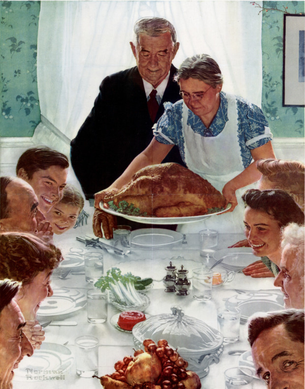
As many folks celebrate Thanksgiving this week, I had an impulse to revisit Norman Rockwell’s iconic painting, Freedom From Want—and to consider Rockwell’s use of color.
Whatever one may think of the content or message of Rockwell’s paintings, it’s my humble opinion that he was a genius at crafting them. Rockwell apparently didn’t consider himself to be much of a colorist, but he certainly used color skillfully to support his storytelling. (Perhaps he was more an illustrator than a painter, though I couldn’t tell you where one draws the line!)
In this painting, for example, notice how the white of the table cloth, curtains, and apron work together with the black of the suit to anchor the painting and frame the turkey, which falls dead center on the canvas. The wallpaper and blouse are analogous colors—which is to say they are next to each other on the color wheel and, in this case, somewhat desaturated— while the turkey, faces, and fruit bowl are roughly the same complementary colors, i.e: opposite the blues and greens on the color wheel. (Were the blues and greens fully saturated, the complement would be more like a fire engine red.)
One’s eye circles the painting, guided by the shades of peach and brown and by the guests’ gazes–finally landing on the cranberry sauce, which offers the most saturated pop of color. Well, that and a little spot of yellow butter, almost hidden but easily found thanks to the subtle point of a hand on the right side of the table.
If you’re interested in learning more about Rockwell’s technique—which included employing photography, projectors, charcoal tracings, and sometimes assistants—check out this informative article.
Here’s wishing you a warm and peaceful Thanksgiving this week (and not just a painting of one)!
No Comments
Sorry, the comment form is closed at this time.