Working with a Restricted Palette
Lately I’ve been asking myself how far I can go simplifying color and still create a successful piece. Most of my work involves a limited palette, though the specific colors in that palette can vary from project to project. While glass is not paint, it’s interesting to explore from a painterly perspective how restricted a palette one can use in glass and still achieve an effective work of art.
I’m inclined to think like a painter, having started out painting and learning about color through paint. Perhaps influenced by this background, my work with glass has pursued a certain economy, always striving to understand how much one can do with the fewest elements. Glass is so seductive as an expression of color; many artists—myself included—are inclined to include every color in the spectrum. Yet so much of the work I love most involves a very limited range, so that’s more often how I’ve tended to think about color.
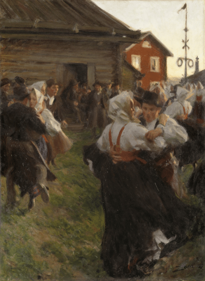
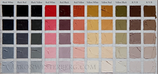
One inspiration is the “Zorn Palette,” which refers to the four colors primarily used by Swedish painter Anders Zorn: ivory black, titanium white, yellow ochre, and cadmium red deep. Paintings like Midsummer Dance above never cease to amaze me in terms of how much is accomplished with these four colors. I recently ran a little experiment with gouache to see for myself how Zorn achieved that green, and sure enough – the black is just blue enough that, when mixed with the yellow ochre, the resulted is a muted green.
Now, Zorn almost certainly worked outside these limitations at times, adding a veridian, maybe a brighter yellow, a little touch of blue. Note the blue of the women’s dress midway on the left. And, it’s hard to imagine that there isn’t a bit of yellow in the grass. But even in those cases, the limited palette seems to have served as an effective starting point.
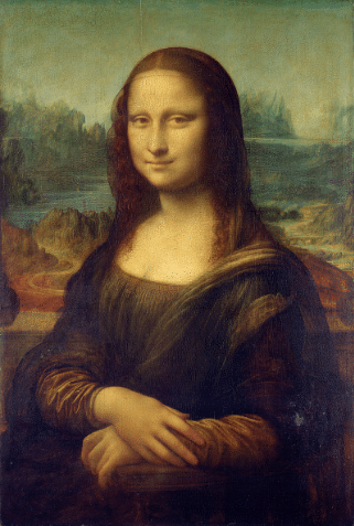
Of course, there are many other great painters who worked with limited palettes; just do a quick Google image search on Leonardo da Vinci, for example.
One of the reasons I’m drawn to limited palettes is that they give a work a certain harmony and atmosphere – as though everything is bathed in a particular color of light, or one is peering through a veil of colored fabric.
Of course, paint is not glass. There are significant differences in how limited palettes play out in these mediums; perhaps most notably, it’s a lot more difficult to make the subtle color transitions in glass that are possible with paint. That said, glass artists have discovered plenty of interesting options. If working with something like mouth-blown Lamberts Glass, one can take advantage of natural color variation within a sheet of glass. One can do all kinds of interesting things with glass frits and powders, which can provide a greater tonal range. There are flashed glass and acid etching techniques used by masters like Chagall. And of course, there are many methods for actually painting on glass.
No matter which approaches or techniques I’m employing for a given project, my own work tends to start with a predominant color, say, blue, plus an analogous color such as a blue-green or blue-violet. Often the piece will stay largely within this limited palette, but I do like to suggest the whole color wheel by throwing in a complementary color – a bit of red or orange, for example. The effect of adding a complementary color is that all the colors are intensified.
No Comments
Sorry, the comment form is closed at this time.